YouPlot: preview data immediately in terminal
Sometimes a series of data is generated on a remote server when carrying out calculations, and you want to see a quick preview without heavy post-processing and pretty plotting. YouPlot is just that amazing tool to plot common graphs in the terminal.
Installation
It can be installed via brew, conda, or gem. On Hoffman2, I would suggest using gem, as the conda installation requires ruby and compilers to be installed, which can be heavy.
1 | module load ruby |
The first command loads the ruby module, and the second command
installs YouPlot locally into your home directory. The
-n~/bin option installs the executable into
~/bin, which should be added into the PATH.
Example usage
Line and lines plot
YouPlot takes .tsv or .csv files or any
other text with similar format, that is a table with columns separated
by specific delimiters. For example, we generate a simple data file of a
sine function using python:
1 | import numpy as np |
After running the above code, the following data is generated in
sine.csv:
1 | x,sin(x) |
We then use YouPlot to plot:
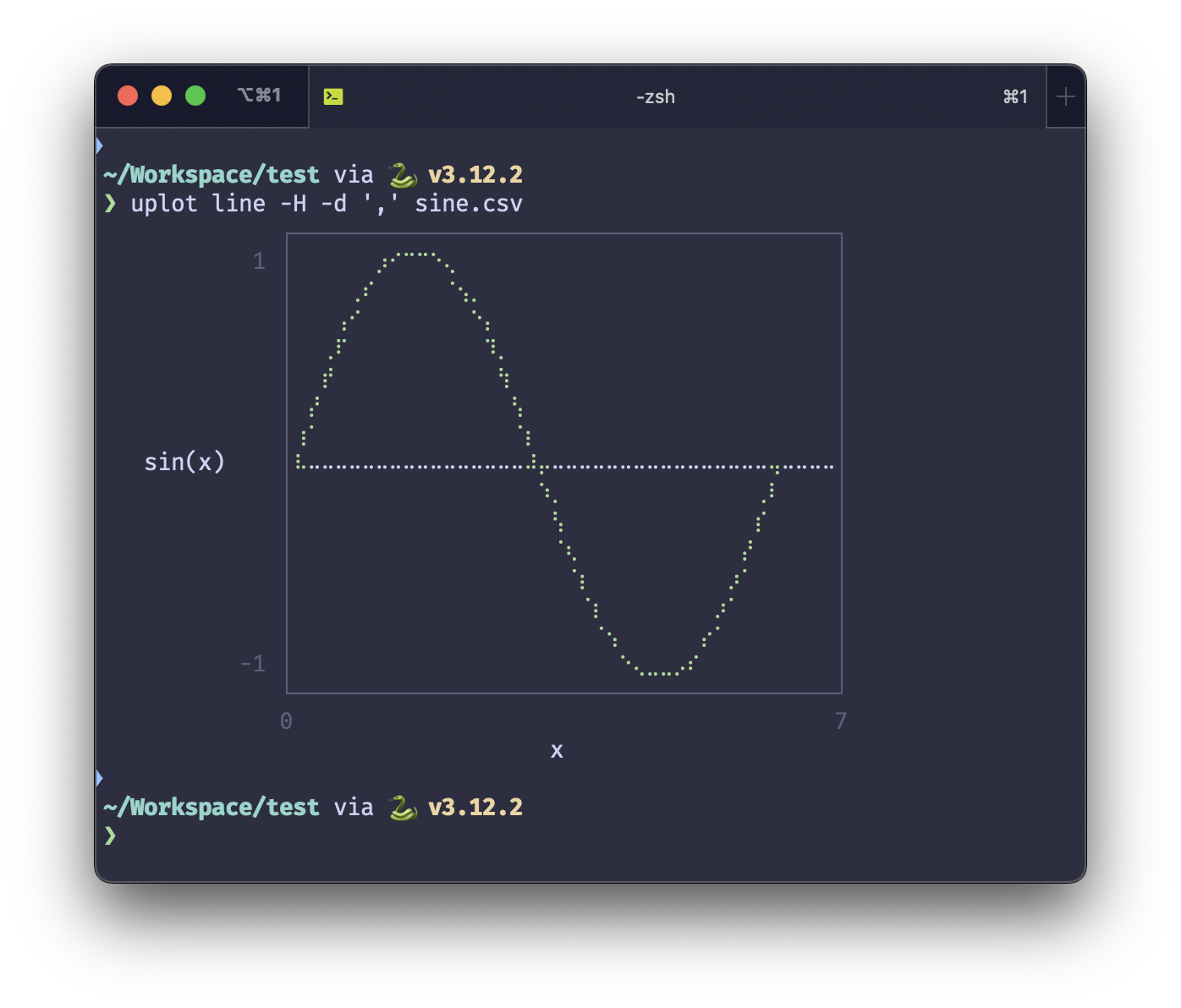
1 | uplot line -H -d ',' sine.csv |
The command line specifies that we want to do a line
plot. The -H option specifies that the first row is the
header, and -d specifies the delimiter. The default
delimiter is a tab, so this option is not needed for .tsv
files.
The result is beautiful:

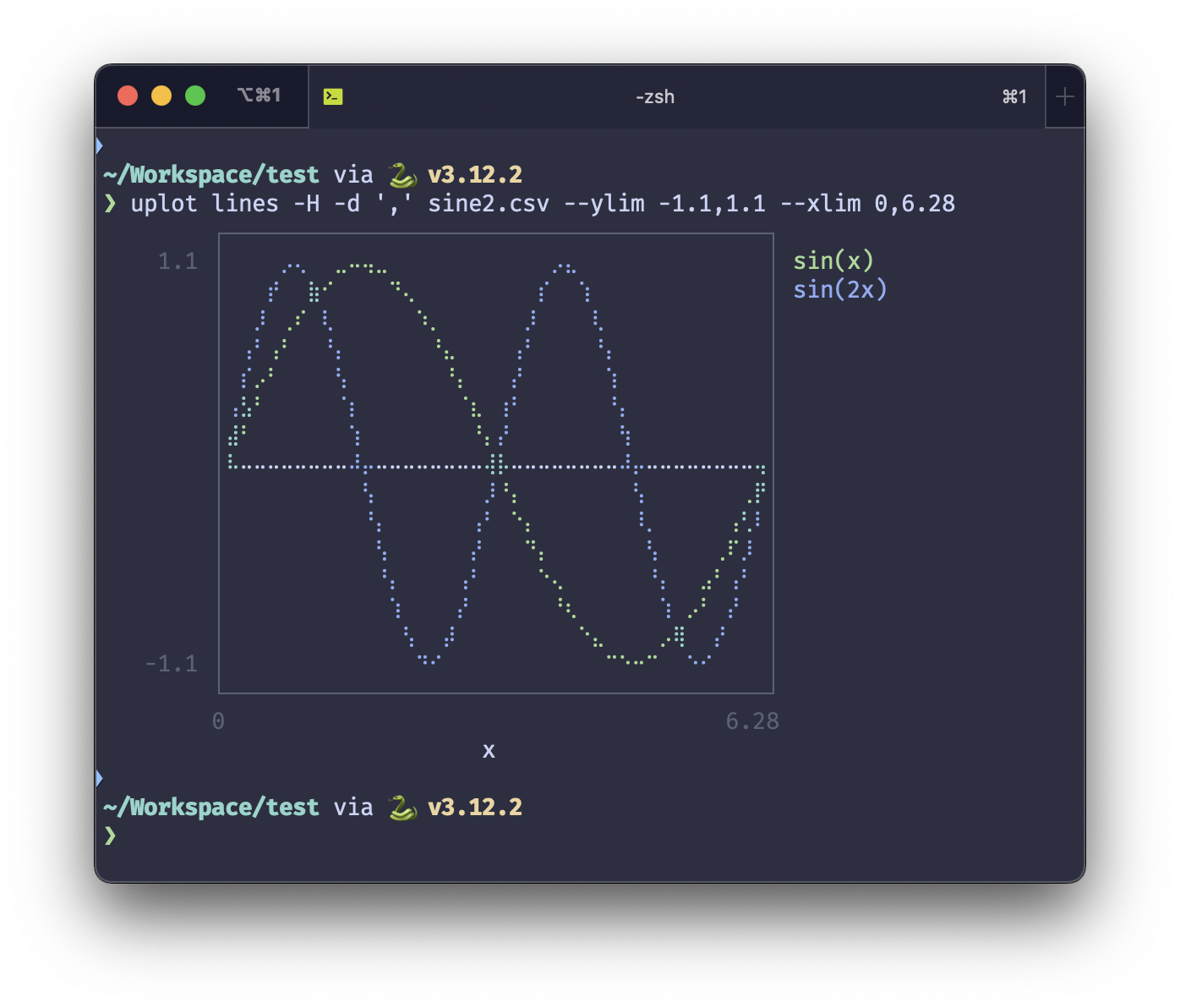
Multiple plots at the same time are also possible:
1 | import numpy as np |
And then:
1 | uplot lines -H -d ',' sine2.csv --ylim -1.1,1.1 --xlim 0,6.28 |
Be attention that here the command is lines instead of
line, due to that multiple lines will be plotted.

Scatter plot
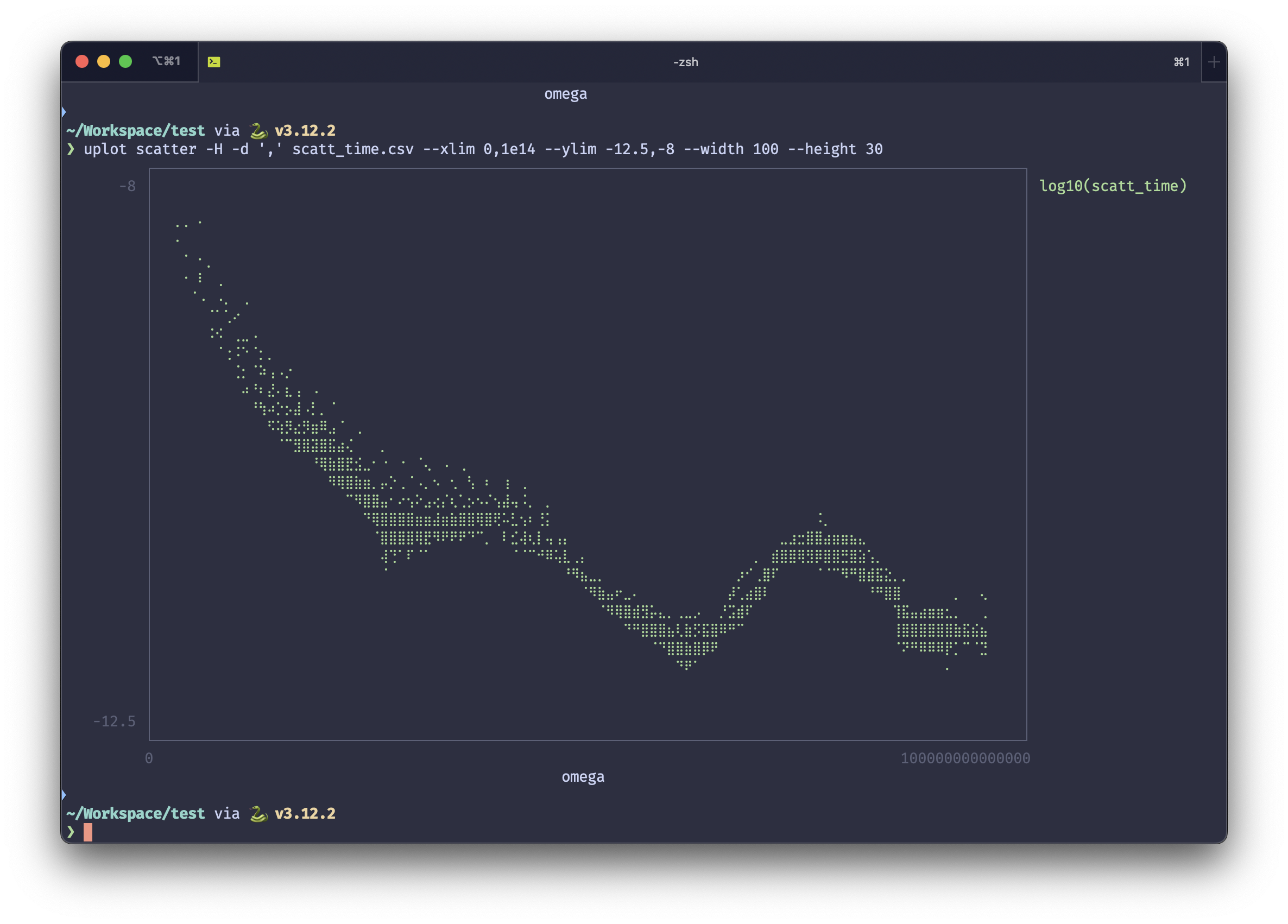
Now we show a more sophisticated example, a scatter plot of the
phonon scattering time, generated by ALAMODE (see the previous post). We store the logarithm of
the phonon scattering time in scatt_time.csv:
1 | omega,log10(scatt_time) |
Here the inf data is due to the 0 value of the
scattering time for the \(\Gamma\)
point. We use the following command to plot the data:
1 | uplot scatter -H -d ',' scatt_time.csv --xlim 0,1e14 --ylim -12.5,-8 --width 100 --height 30 |
The result is awesome:
